01 / The opening
See the first impression.
Show the quality and range of a fresh-produce business through a confident website experience without publishing its existing identity or operational details here.
Selected work / Fresh produce
Fresh thinking. Clearer discovery.
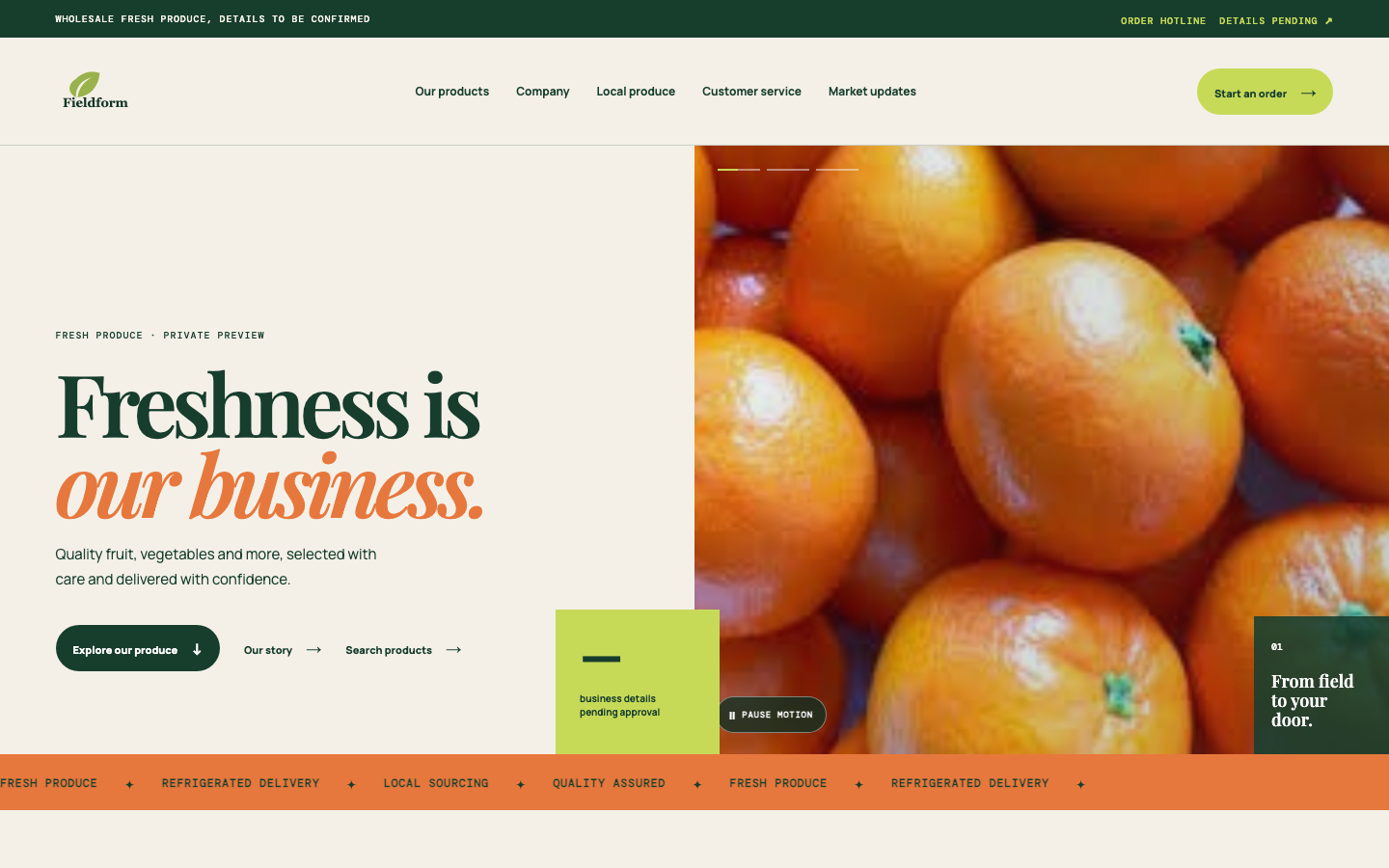
The working fresh-produce website has a bold editorial opening, clear product journey and mobile layout. This portfolio version replaces the original company identity and withholds unapproved details.
The project story
Show the quality and range of a fresh-produce business through a confident website experience without publishing its existing identity or operational details here.
Keep the original site's split-screen composition, typography, produce imagery and structured page flow; use a new neutral name and mark for this pending presentation.
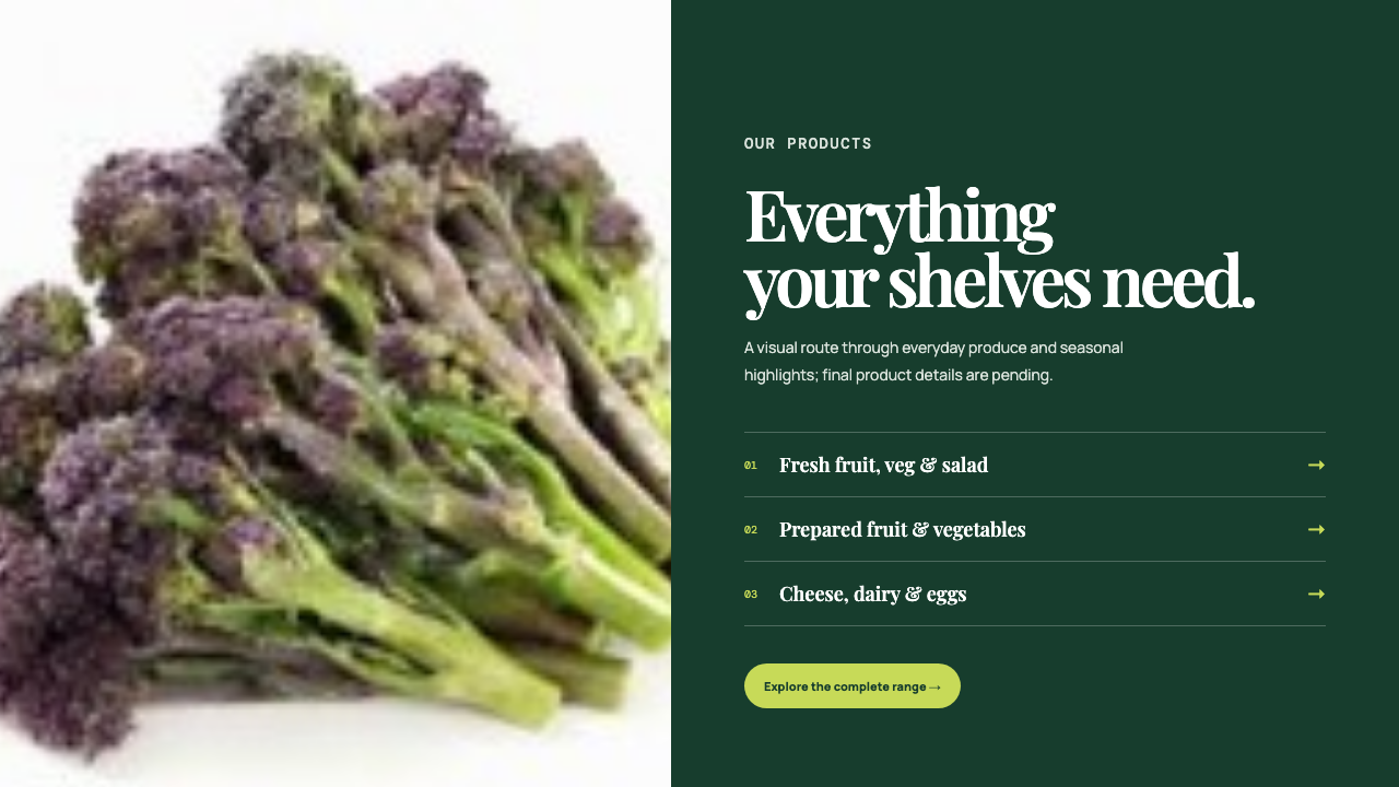
A working, responsive website direction with a distinctive opening, product sections and clear navigation. Business details and client launch approval are pending.
The design direction / On film
Two walkthrough spaces are reserved for the homepage opening and product journey. Neither video is presented as finished footage.
Video placeholders / ready for final footageVideo to be added01 / Opening filmOpening film
Video to be added02 / Product journey filmProduct journey film
Website journey
Explore two areas of the same in-progress website. This slider compares the site journey, not an old website with a launched redesign.
The opening view and product section show two connected parts of this working website.
Editorial typography and an open section grid make the page feel more considered while final business facts are withheld.
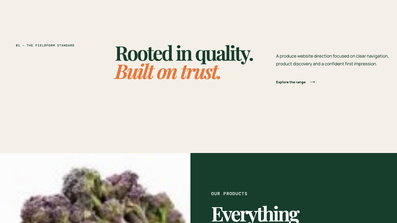
These are sections of one in-progress website, not an old-site-versus-new-site comparison or an approved launch.
Work at a glance
The full current produce website structure, presented under a neutral name and mark while approval is pending.
A strong editorial headline and rotating produce imagery make the category clear immediately.
The product section gives visitors a direct route into the range without a dense homepage list.
The existing business branding has been replaced with a distinct Fieldform mark for this portfolio presentation.
The same typography and visual rhythm carry through to the narrower mobile layout.
Inside the project
Explore the visual direction, proposed page journey and mobile treatment using screens from the private preview.
Opening view
The homepage retains the current site's layout, motion and split-screen composition under a neutral identity.
Product journey
Produce photography and a concise category list give visitors a clear next place to explore.
Page structure
Editorial typography and an open section grid make the page feel more considered while final business facts are withheld.
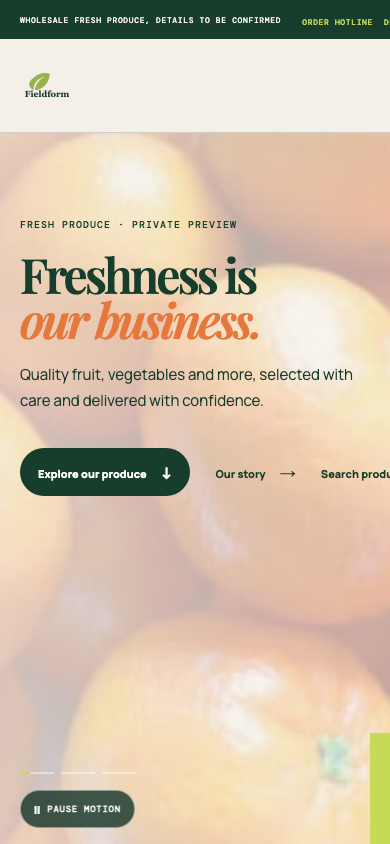
Mobile preview
The same working design stacks into a single-column mobile opening.
Honest project status
This is an in-progress website design presented as Fieldform Produce for privacy, not a claim that Fieldform is the client or a launched business. The original company name, logo, contact details, people, locations and operational claims have been removed from this portfolio version. Final client review and launch approval are pending; no performance results are claimed.
Your project next
Start with a free homepage mock-up and see what a clearer, more useful online experience could look like for your business.