Clearer hierarchy
A confident opening message and deliberate sections guide visitors through the page in a useful order.
Project 01 · Hospitality
A warmer, clearer website direction for a family-run tea room—designed to make the menu, afternoon tea, catering and visit information easier to find.
The brief
Bring a much-loved local business up to date without losing the friendly, homemade character that regular customers already know.
Reorganise the experience around the questions a visitor is most likely to ask: what is on the menu, what can I order, where is it, and how do I get in touch?
A warm, editorial direction with clearer page structure, readable menu content and stronger routes to call, order or plan a visit.
Before and after
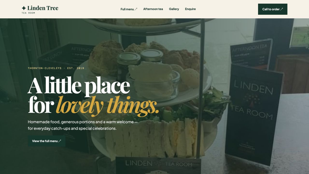
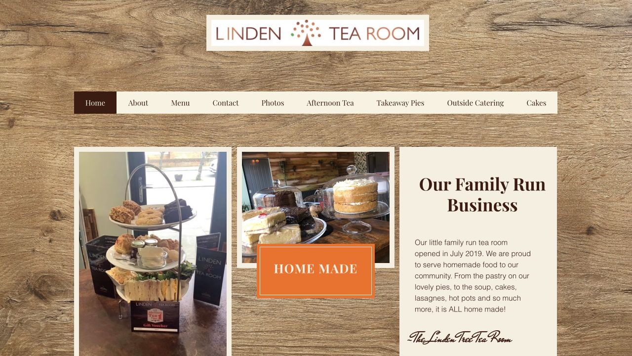
The existing website held plenty of useful information, but key journeys were spread across several pages. The redesign brings the most important content into one clearer path.
What changed
The visual direction is only part of the work. The structure underneath is designed to help visitors understand, trust and act.
A confident opening message and deliberate sections guide visitors through the page in a useful order.
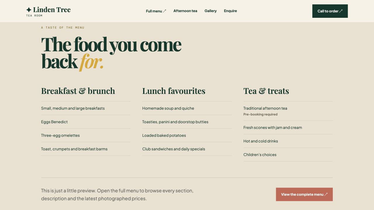
Key menu categories become searchable, scannable text instead of relying on image-only information.
Calls, menu views and enquiries are made visible at the moments a visitor is ready to act.
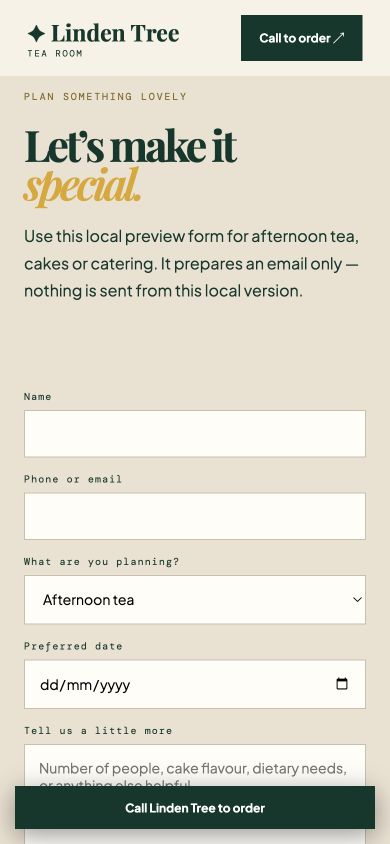
Content stacks cleanly and the most useful contact action stays within easy reach on a phone.
Project walkthrough
Select each view to explore how the concept carries the same clear direction through content, imagery and mobile use.
Menu structure
The concept presents key menu categories as clear, scannable sections and keeps the full menu one click away.
Visual story
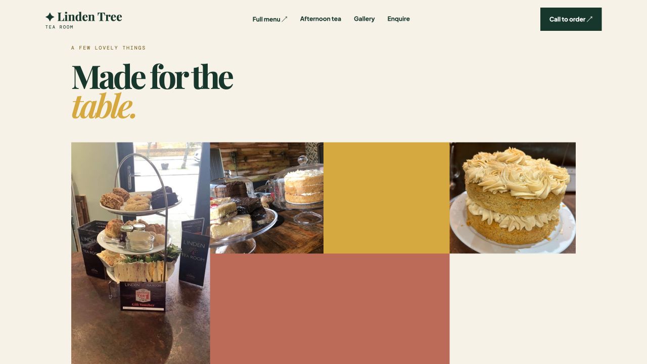
A photography-led gallery keeps the food and atmosphere central without making the page feel busy.
Mobile journey
On mobile, the enquiry concept becomes a clear single-column journey, with a call button kept within easy reach.
Concept shown with permission. The redesign is in progress and has not yet launched, so no performance results are being claimed.